BlogPost 211575206202 What unified commerce really means for customers
Takeaways from a retail leaders' meetup at Hedonism Wines: why unified commerce is an organisational challenge, and what each channel should stop...
Rachael Rea-Palmer
Apr 23, 2026
BlogPost 210047183408 The Conversation Enterprise Leaders Are Actually Having About AI
Reflections from our recent breakfast roundtable with financial services technology leaders
Jimmy Taylor
Mar 27, 2026
BlogPost 208748633093 Rust and Crux in the Enterprise: Cross-Platform, Correct by Design
Two companies. Millions of users. One architectural pattern built on Rust and Crux - and what it means for engineering at scale.
Stuart Harris
Mar 9, 2026
BlogPost 208293439806 Two Days at the Heart of Rust
BlogPost 206876057704 Red Badger and Sitoo Partner to Accelerate Unified Commerce for Retailers
BlogPost 206755943791 Rebecca Glassby to lead Red Badger’s Strategic Hub in Cape Town
BlogPost 206215819393 Engineering Culture: The Hidden Operating System for Scaling Success
BlogPost 201185875504 Reflections from Red Badger's 2025 Partner Day
BlogPost 198816103528 Is customer-first transformation in insurance unavoidable?
BlogPost 197378028634 The Experimentation Gene: Turning Personalisation from Tactic to True Customer Value
BlogPost 193631555634 Red Badger's Design School Returns to Engage Next Generation of Digital Leaders
BlogPost 192472738063 Red Badger expands Enterprise Solutions Capability with Strategic Leadership Hire
BlogPost 191805559084 Earning Devotion: The Evolving Challenge of Customer Loyalty In Retail
BlogPost 191086326319 Red Badger hires former John Lewis Head of Product to lead Retail & Hospitality practice
BlogPost 191001050245 Red Badger partners with London Business School
BlogPost 189548330518 Retail Visionaries
BlogPost 185752077158 Celebrating Equipmii: A Game-Changer in Inclusive Shopping
BlogPost 185028228677 Red Badger hires Houses of Parliament CIO to lead new Public Sector practice
BlogPost 182985697858 Five Lessons Learned from Implementing OpenTelemetry
BlogPost 183056183639 RED BADGER'S INNOVATIVE SOLUTIONS HIGHLIGHTED AT COP29 IN BAKU
BlogPost 177953041446 Breaking the mould - How big corporates can select top tier partners
BlogPost 177591522921 Embedded Finance - The Next Profit Frontier
BlogPost 177600206141 Creating Flexible, Innovative Financial Platforms
BlogPost 177599235350 Ensuring Security and Compliance with Embedded Finance
BlogPost 177596669516 Enhancing Merchant Experience with Embedded Financial Services
BlogPost 177594597561 Simplifying Global Expansion with financial technology partners
BlogPost 177598251689 Leveraging Data Insights for Strategic Growth with Embedded Finance
BlogPost 176020802897 Red Badger and Civo Partner to Revolutionise Cloud Computing with Advanced Kubernetes Solutions
BlogPost 175091322498 Red Badger Sponsors the Individual Category at the OpenUK Awards 2024
BlogPost 175085966918 Carbon efficient high density enterprise workloads with scale-to-zero WebAssembly
BlogPost 172913390216 Payments Data to Drive Revenue in the Sports Industry
BlogPost 172913390343 Building a Marketplace for Producers: Lessons from Wylde Market
BlogPost 172913390403 Power Small Businesses with Integrated Financial Solutions
BlogPost 172912711824 Sophisticated Payment Functionality is Easier Than Ever Before
BlogPost 172596604740 Red Badger and Tuum Join Forces to accelerate finance innovation.
BlogPost 162108798249 The Pitfalls of High-Volume Transactions
BlogPost 163259242270 The Importance of Customer Loyalty in Today's Market
BlogPost 162019390778 Scaling Internationally: More Than Just A Copy Paste
BlogPost 162011754842 Adyen for Platforms: A Guide to Integrated Payment Solutions
BlogPost 163241158483 The Role of Technology in Overcoming Cross-Border Retail Challenges
BlogPost 161973683204 Red Badger & Adyen: Empower the growth of your platform
BlogPost 162011014452 Crafting Inclusivity Through Digital and Physical Accessibility
BlogPost 162008203955 The Lasting Impact of Brexit on Global eCommerce
BlogPost 159361644809 The Convergence of Physical and Digital Accessibility in Retail
BlogPost 162102214782 Red Badger and CADA Design on the Frontline of Accessibility
BlogPost 157811818010 Navigating the Future of Global eCommerce
BlogPost 159332192912 Our Cross-Border Retail White Paper
BlogPost 156708616817 Red Badger to Speak at Rust Nation 2024
BlogPost 147809893971 Mapping the Future of Sustainable Digital Products
BlogPost 145595634311 Revolutionising Retail: How Super Payments is Changing the Game
BlogPost 144727981991 Exploring the Sustainability Challenges in Finance
BlogPost 143727084393 Efficiency by Design: The Sustainable Future of Digital Infrastructure
BlogPost 143071267423 How Tap to Pay is Changing Retail, Featuring Adyen and Sweaty Betty
BlogPost 144733633795 A Roadmap for Stitching Loyalty into the Digital Fabric of the Fashion Industry
BlogPost 143683823774 The Power of Green UX: Nudging Users Towards Sustainable Choices
BlogPost 139082703216 Why Adyen's Issuing Technology is a Strategic Fit for Online Travel Retailers
BlogPost 139038551966 The Evolution of Digital Payments - What is Issuing?
BlogPost 136387977303 Cogo: Combining AI, Green Engineering & Finance for a Sustainable Future
BlogPost 136581558362 The Future of Product Management? The blend of AI and Human Intelligence
BlogPost 136580723058 How AI, Rust, and WebAssembly Are Shaping the Future of Coding
BlogPost 134901544820 AI and Financial Services: Digital Innovation with Red Badger & Split
BlogPost 131663768125 Retiring React Native in Favour of Rust
BlogPost 130654830774 Red Badger & Cogo: Championing a Greener Digital Future
BlogPost 131151518086 AI: Better code for Better Digital Experience
BlogPost 131668187680 React Native Vs Rust
BlogPost 128017125004 Red Badger is proud to be a sponsor at the OPEN:UK Awards 2023
BlogPost 123364804981 Delivering Seamless Customer Experience in the Energy Sector
BlogPost 128113005347 Rust & CRUX: The Future of Sustainable Enterprise Software Development?
BlogPost 126729428022 How is Generative AI Transforming Product Development in Blue Chips?
BlogPost 125564188291 Can Generative AI and Green Engineering Boost Loyalty in Blue Chips?
BlogPost 125454642796 Green Engineering by Design: The Future of Sustainability in Tech
BlogPost 125301052495 AI for Customer Experience - Event Follow up
BlogPost 124339409503 Responsible AI: The Key to Sustainable Growth?
BlogPost 123714982942 Red Badger and Split: A Partnership for Sustainable Digital Product Development
BlogPost 124285283872 Ethical AI: Reflections on Responsible AI, Sustainability, & Innovation
BlogPost 123756898446 A Transformative Digital Platform for Exam Providers Globally
BlogPost 124998309762 Brewing the Future: How Generative AI is Changing Beer Production
BlogPost 125250394682 AI in Digital Products - Our Tech and Product Directors discuss...
BlogPost 122674686291 Embracing Rust for Sustainable Enterprise Transformation
BlogPost 124992291212 Responsible AI: Pathways to Sustainable Growth with Dr Chris Brauer
BlogPost 122329786931 Red Badger Partners with Dr. Chris Brauer and SYMMETRY for Enterprise AI Innovation and Transformation
BlogPost 124336817554 Navigating Challenges in AI Development
BlogPost 121606988903 Transforming Customer Experience: The Role of Responsible AI
BlogPost 162127747482 The Changing Nature Of Cloud Native Ledgers In The Finance World
BlogPost 119026831782 Exploring Rust: A Sustainable Approach for Enterprise Application Development
BlogPost 119063657331 Our Top 10 Takeaways from Money 20/20 so far
BlogPost 118832471334 Embracing Rust for Enterprise Application Development
BlogPost 121867169959 Bridging Innovation and Customer Experience: The Power of AI
BlogPost 118125230877 Red Badger and Split to host LeadDev Conference After Party
BlogPost 116411032709 Rust Foundation Welcomes Red Badger to Champion the Use of Rust in Enterprise
BlogPost 116583321134 The Future of Money: Red Badger Gears up for Money 20/20
BlogPost 116391433250 The Journey Towards Sustainable Fashion
BlogPost 116560258119 Discussing our Nando's collaboration at BIMA Round Table Event
BlogPost 113883578517 How a Sustainable Codebase Can Cut Enterprise Costs and Carbon
BlogPost 111683753373 Red Badger Announces Partnership with Contentful
BlogPost 113283240632 The Changing Nature of Consumer Demand: How Sustainability is Shaping the Future of Fashion
BlogPost 113299475742 Consumer-Driven Fashion: How Brands are Meeting Customers' Expectations with Technology
BlogPost 113289326377 Blending Sustainability and Profitability: How Brands are Balancing Both
BlogPost 110666400031 Pioneering Digital Solutions for Social Mobility and Equal Opportunity
BlogPost 109800761727 How businesses can use data to understand their customers better
BlogPost 109616040351 Using payment data to unlock customer insight
BlogPost 109309050405 Event Roundup: Strategies for Seamless Customer Experience
BlogPost 109118723990 Strategies for creating seamless customer experiences
BlogPost 106883916041 Why are basketball players tall?
BlogPost 104618376742 Red Badger launches CRUX - Headless app development in Rust
BlogPost 104260020512 iOS, Android and Web applications that share a single Rust core
BlogPost 103617459979 Red Badger announces launch of new digital customer onboarding journey for Security Bank
BlogPost 103676845623 Introducing CRUX
BlogPost 101371434828 ON DEMAND VIDEO - Product Impact with Split
BlogPost 101319628874 10 reasons why you should be exploring autonomous stores
BlogPost 91173617682 Engineering for ambition with Adyen
BlogPost 97803598613 Why we love Split
BlogPost 97446320730 Red Badger partners with Split.io for world class digital products
BlogPost 95861950837 Red Badger keynotes at Rust Nation 2023
BlogPost 95216989468 How to build a culture of experiential learning
BlogPost 93467109999 Red Badger partners with Adyen to bolster payment capabilities
BlogPost 91045183577 Building a Fortnum & Mason e-commerce store in two days
BlogPost 79934697887 Product strategy as your competitive advantage
BlogPost 90115504428 How enterprises create great digital products in 100 days
BlogPost 90277234815 4 steps to great digital products and a better product business
BlogPost 90268301684 100 days to #CreateGreat - Digital Products for Blue Chips
BlogPost 87213570671 Flexible work & parenting: Becoming a Badger & a dad in just 6 weeks
BlogPost 86431031212 Park life! Volunteering in the local community
BlogPost 83780715440 The Big Debate: Is the future of loyalty point-less?
BlogPost 83780715357 [Step-by-Step Guide] 5 Steps to a loyalty product your customers love
BlogPost 83767361686 Subscription is the new loyalty and other takeaways from HOSTECH 2022
BlogPost 83767361628 Why I am proud to be a Badger
BlogPost 83767079693 Meet our Loyalty Panellist: Dave Robinson from Boots
BlogPost 83765989908 Meet our Loyalty Panellist: Gianfranco Cuzziol from Natura & Co
BlogPost 83765989774 Meet our Loyalty Panellist: Candice Lott from We Are The Digital Type
BlogPost 83530504102 Point-based vs point-less: Time for loyalty to evolve?
BlogPost 83550114428 [Infographic] Is the future of loyalty point-based or point-less?
BlogPost 83024843267 Consumer Duty: how a digital mindset can solve its 6 biggest challenges
BlogPost 82863195054 Delivering a lean digital product in two weeks
BlogPost 79941304340 Writing Envoy filters in Rust with WebAssembly
BlogPost 79935463807 [Video] The Future of Digital Loyalty: Loyalty as a Service
BlogPost 79941304170 [Video] The Future of Loyalty: How Nando's meets the demands of Gen Z
BlogPost 79941304156 [On Demand Webinar] Next-gen cloud connectivity: The evolution of NATS
BlogPost 79935463805 [Video] The future of digital loyalty: loyalty according to Gen Z
BlogPost 79935463781 [White paper] Multi-cloud platforms are here
BlogPost 79941304145 How to use test automation in software development
BlogPost 79935463806 8 guiding principles for your tech strategy
BlogPost 79934697882 What loyalty leaders have to say about loyalty programmes in 2022
BlogPost 79934697872 7 key benefits of automated testing in software development
BlogPost 79941304183 Fixing climate change with digital product thinking
BlogPost 79941304138 Mission thinking: embracing an experimentation mindset
BlogPost 79941304139 Mean Time to Repair (MTTR): One of your most important metrics
BlogPost 79941304143 Fixing climate change with the circular economy and digital technology
BlogPost 79928678732 Learning to fail to deliver digital product success
BlogPost 79941304141 How to use service design for validating ideas
BlogPost 79935463787 The key advantages of using a monorepo
BlogPost 79934697985 What is Infrastructure as Code (IaC)?
BlogPost 79941304177 Microplatforms. The best enabler of continuous deployment ever
BlogPost 79941304191 Why Pipeline as Code is adding value
BlogPost 80441752204 Earning brand loyalty with the Kano Model
BlogPost 79935463783 Elevate your design thinking with sketch thinking
BlogPost 79941304332 4 key takeaways from Kanban Management Professional training
BlogPost 79941304181 One minute reads: forecasting with Little’s Law
BlogPost 79934697888 Introducing an Agile Delivery Framework to the public sector
BlogPost 79928678721 Meet our Loyalty Panellist: Robert Bates from Currys
BlogPost 78700136803 [Video] Four Reasons Digital Natives Create More Loyal Customers
BlogPost 79941304148 Subscription is the new loyalty and other takeaways from HOSTECH 2022
BlogPost 79935463789 Be a force multiplier
BlogPost 79941304155 Transforming blue chips into next generation Digital Product companies
BlogPost 95847203339 Red Badger wins Business Reporter's 2022 Digital Leader Award
BlogPost 79928678730 How service design is helping Anthony Nolan to simplify time-to-transplant
BlogPost 83989299274 [On Demand] Here's why we love WebAssembly (outside of the browser)
BlogPost 79935463778 A truly resilient multi-cloud platform with wasmCloud and WebAssembly
BlogPost 79941304132 LGBTQ+ History month: Championing our favourite tech heroes
BlogPost 79941304151 Secure your business: how to protect yourself from the next Log4j
BlogPost 79941304140 Slay corporate risk, innovate faster
BlogPost 79941304154 7 steps to perfect retrospectives to align teams on shared values
BlogPost 79928678731 A product transformation mindset to tackle social inequality
BlogPost 79941304134 How Gen Z think about loyalty and why you need to align your strategy
BlogPost 79935463784 Building a digital product organisation to tackle social inequality
BlogPost 79928678726 Pride 2021 & the Red Badger Social Value Taskforce
BlogPost 79941304194 WebAssembly: The days of cloud vendor lock-in are over
BlogPost 79928678714 Align and integrate: how to cultivate loyal guests
BlogPost 79928678720 Standing out from the crowd: creating memorable customer experiences in retail
BlogPost 79941304171 How hotels can own their guest experience
BlogPost 79941304130 The key to overcoming poor guest experience in Hospitality
BlogPost 79935463785 How to build loyalty programmes retail customers actually want
BlogPost 79941304126 Start small but think big: how to build a digital roadmap
BlogPost 79934697873 How to measure psychological safety
BlogPost 79941304135 New product development in a brave new world
BlogPost 79941304147 Desirability testing: Innovation at the British Heart Foundation
BlogPost 79928678719 Understanding burnout and anxiety - Lunch & Learn by Spill
BlogPost 79934697871 Can API Products help grow your customer base?
BlogPost 83788175442 How Gen Z think about loyalty and why you need to align your strategy
BlogPost 79935463795 How to launch a scalable optimisation programme for digital products
BlogPost 79934697909 How product thinking can help solve society’s grand challenges
BlogPost 79941304167 6 ways to build an unproductive product team
BlogPost 79934697885 Teaching people with special needs how to code
BlogPost 79935463813 How to talk about race and diversity?
BlogPost 79935463770 Designing for complexity: Delivery Framework for the Government
BlogPost 79935463808 Introducing the remote North Star Framework
BlogPost 79934697886 Successfully introducing User Experience Design (UXD) from scratch
BlogPost 79935463786 UX Design: Getting user feedback into the backlog
BlogPost 79935463811 Working in the open with the FutureNHS platform
BlogPost 79928678718 Mission Beyond Q&A with Matthew Syed on cognitive diversity
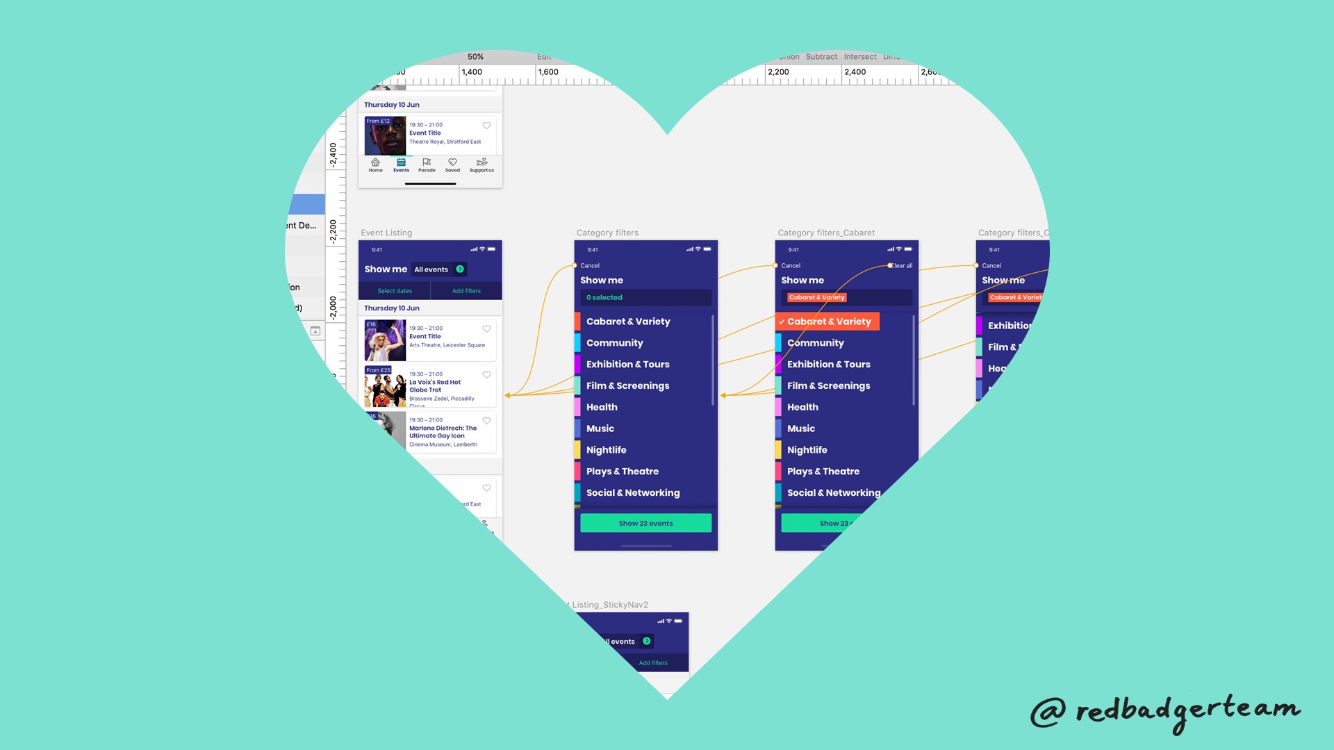
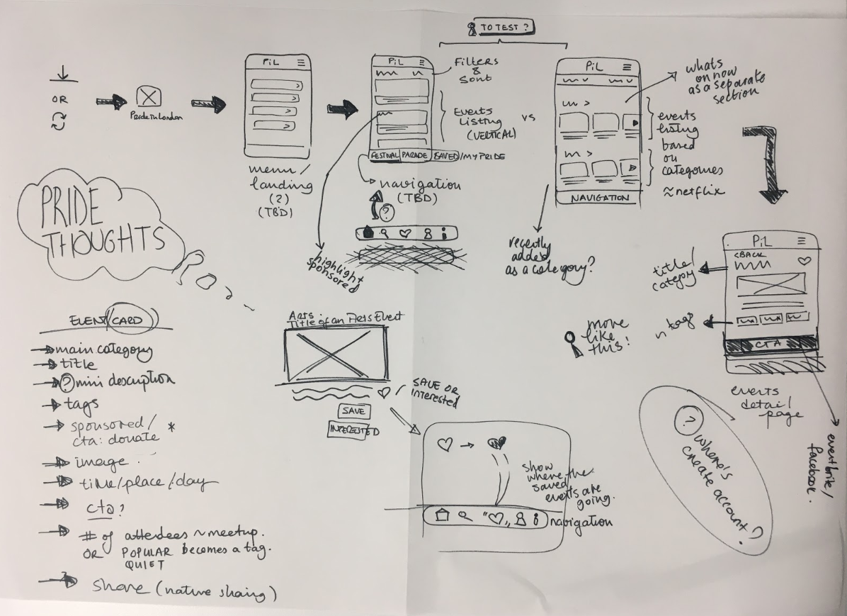 Early wireframes helped communicate the UX direction back to the team and stakeholders in a quick and iterative way.
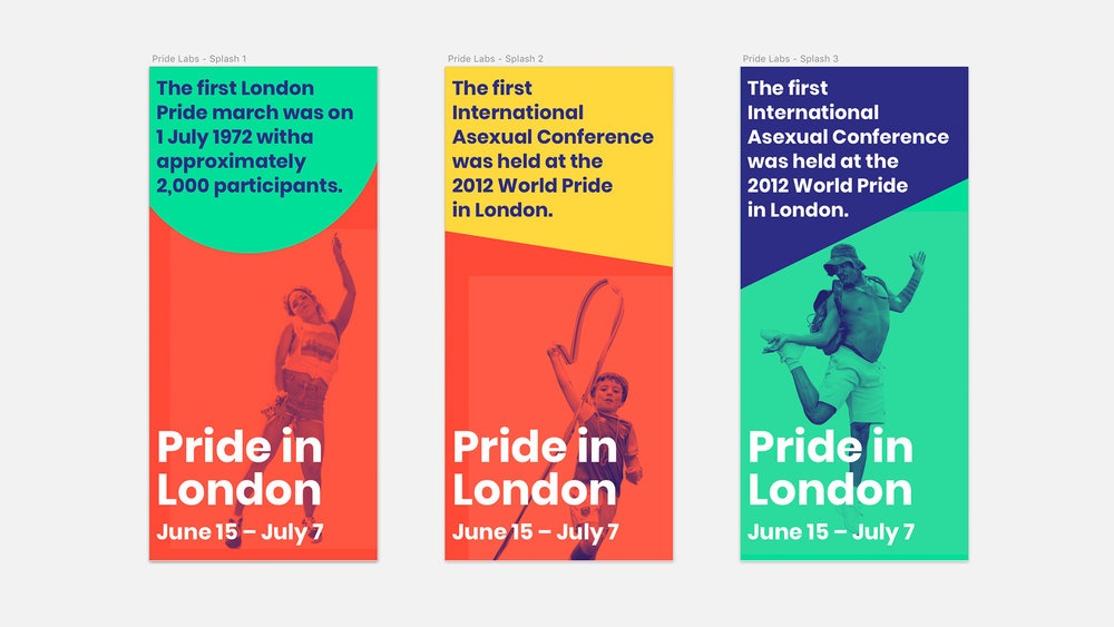 Early branding direction from the Pride Labs workshop, surfacing the timeline of the festival
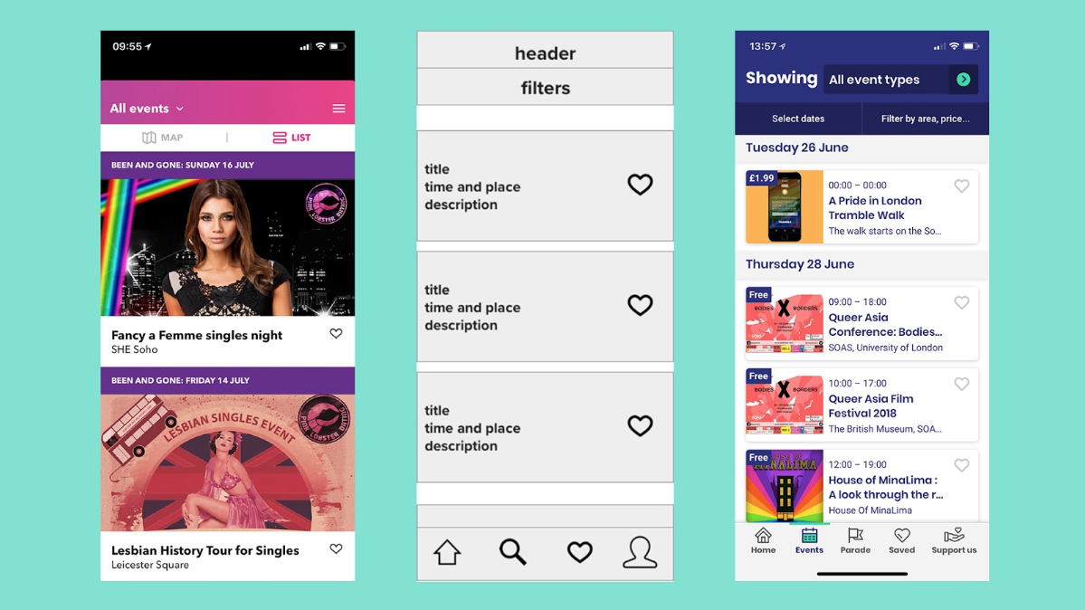 Previous year’s app and early wireframe for Event Listing Page. App in production far right.
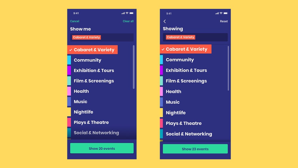 Earlier interface on the left and updated version on the right after usability testing
Add a Comment: